Crime Rates in Canberra

The Task
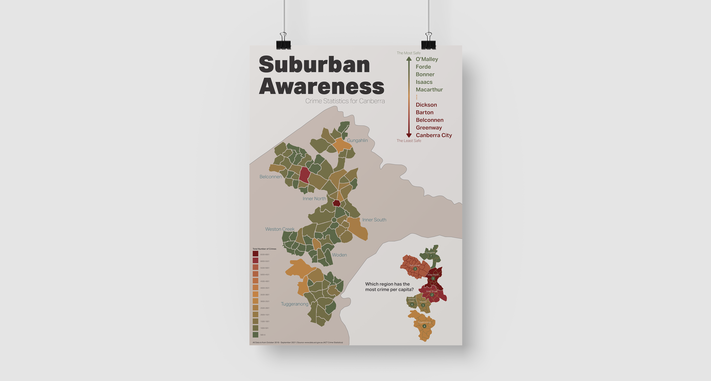
This project was all about how to visualise data, I had to locate a dataset and then find a visual way to represent it. I used the ACT Crime Statistics (2021) dataset, which looks at the different types of crimes committed in the ACT, and in which suburb they occurred. I used the 2018 to 2021 data from this set.
Since I chose a data set that has geographic data, the obvious choice was to use a map in some form. I planned to have a large map that was divided by suburb in the centre of the graphic and then have a few other visualisations around the map that show other interesting statistics. I would include data like the number of crimes per region, ‘top’ suburbs, and a percentage breakdown of the different types of crime (Figure 1).
The Design Process
I spent a significant portion of time sorting through the data to begin with, through which I calculated the total crimes committed in every suburb and each geographical region across the three-year chosen period. I used a colour gradient to communicate the different amounts of crime committed in each suburb on a map.

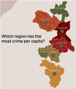
The next variable in the data I wanted to visualise was the number of crimes committed per geographical region in Canberra. At first, I created a list, but I realised after creating it, that it relied heavily on text to communicate, and that the data could be shown more clearly with a map. As a result, I created a map of Canberra that was divided by region, such as: Tuggeranong; Belconnen; Gungahlin.

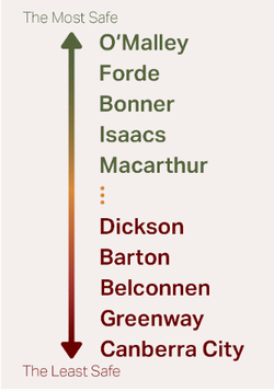
I created this map because I thought it would be an interesting way for people to determine which suburbs are the safest or the least safe in Canberra. Although this can be deduced through the map, I thought it would be appropriate to clearly indicate the 5 safest suburbs, and the 5 least safe suburbs. I created a text list which uses colour and colour gradient (similar to that which was used on the map) to quickly and visually inform the audience of these 2 variables.